


Bedroom update: Pondering's & Processes
From Blah to Bold in a weekend...

(This post refers to details of a previously declared partnership between Little Greene Paint Company and myself. This substack post is not part of the agreement.)
I don’t know about anyone else, but, as as a self-confessed serial room renovator and (indecisive) decorator, I find that areas of my home get neglected when I am focused on a specific bit. Lately our attention had been on the hallway and landing meaning that certain rooms had become a bit, lacklustre? Especially when compared to a freshly painted and preened space. those other rooms suddenly and overwhelmingly, just don’t cut it.
Our bedroom had become rather uninspiring to me, and so when I broached the subject of changing it up with my husband he simply nodded and told me to do “what I had to do” which was/ is the green light to go ahead if I ever I heard one (it is though right?…)
When I say I love painting and decorating; I mean; I LOVE IT and so, far from being a daunting undertaking, the prospect of making over our primary bedroom was very exciting to me. I enjoy having a project on the go and a focus helps to steer my energy in the right direction. Paint is the ultimate transformer, and really anyone with a roller and some patience can do it (although my technique has improved massively over the last decade. Well I think so anyway.)
I was lucky enough to partner with one of my favourite paint brands on this project, Little Greene Paint Company, an outstanding family-run business, producing the highest quality, hard wearing paints in the most sumptuous shades. The brand had just launched a new capsule collection of colours when I was looking at paint for the bedroom and I fell HARD for the palette. Each tone inspired by warm, neutral shades of honey, caramel and chocolate, or as Little Greene put it;
“This palette of nine versatile colours will bring warmth and comfort, creating cosy enveloping interiors that appeal to all the senses…”
And so it felt like serendipity to work with them again….
Here I talk about my inspiration and process for pulling this look together:
The Vibe.
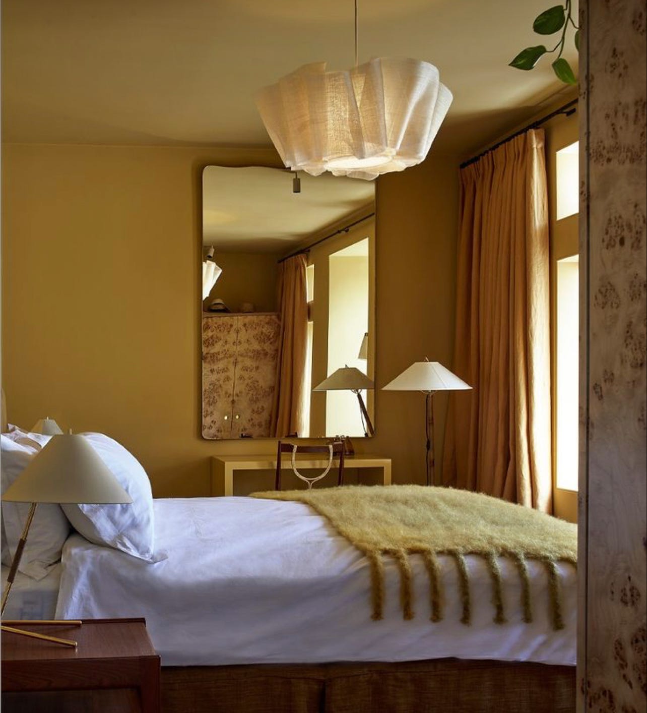
Pinterest, and my head, are my go to’s when it comes go to designing a new space. I usually have an idea, somewhere in my brain which is then developed through a visual search. I wanted something warm, cosy, modern and unexpected.
I don’t like to assign my style a specific label as it changes often (and is very mixed) but if I had to I would probably say that it is eclectic with Scandinavian, industrial and rustic elements. It has a strong sense of itself and is well curated, but not formal. I like a room that has structure, and definite lines but that feels welcoming and soft. Is bold but calming and is layered but not full on maximalist. I also enjoy a more restrained pallet and lots and lots of texture.
I wanted to go deeper and darker on the walls and incorporate some colour, coming away slightly from my more signature style. I had a vision of simple Scandi- inspired furniture, set against toffee coloured walls with pops of colour (in textiles and bedding etc.)
I envisioned oodles of texture, and contrasted with sharp black accents. My core style but a little braver and bolder.
Colour.
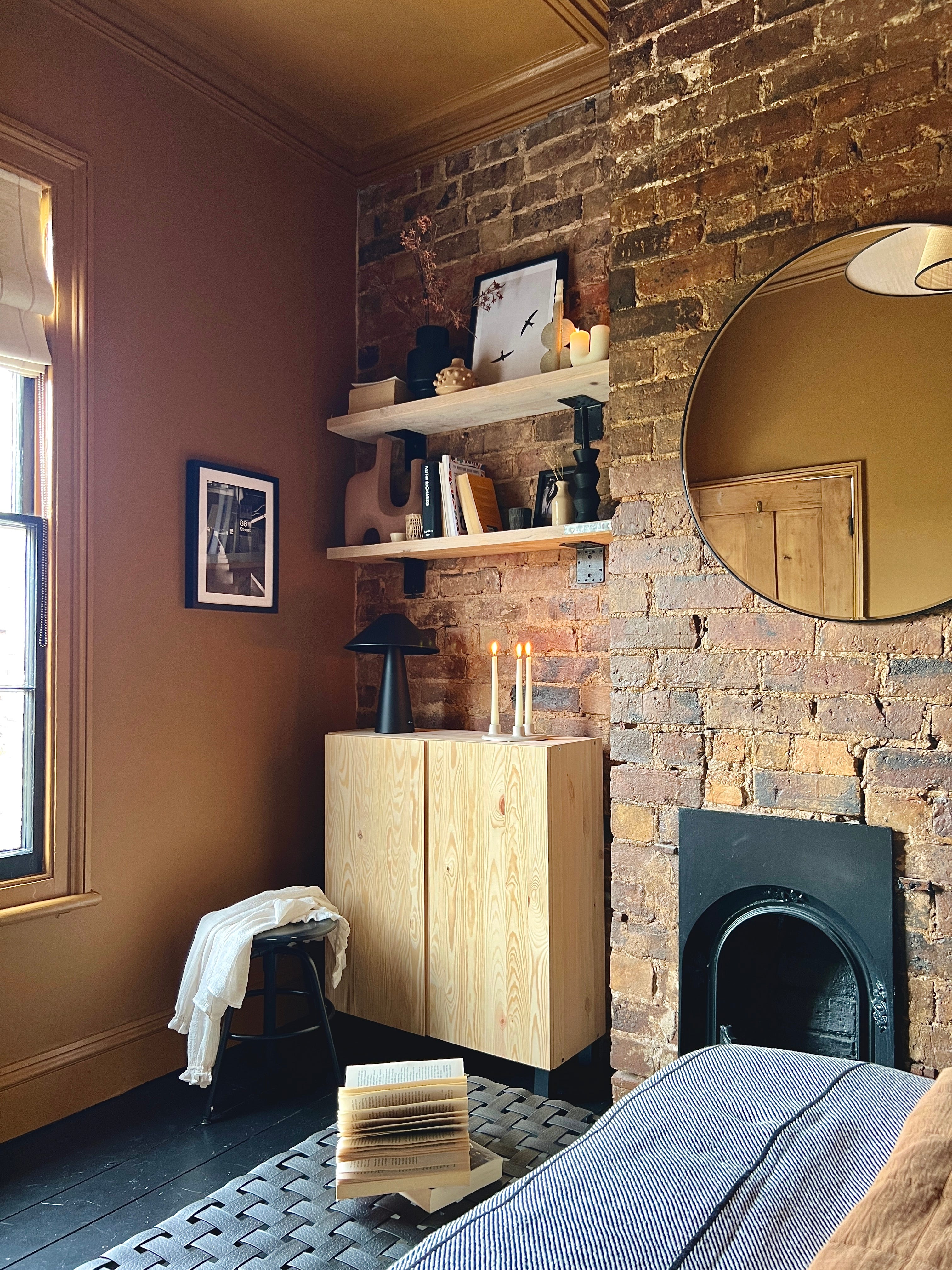
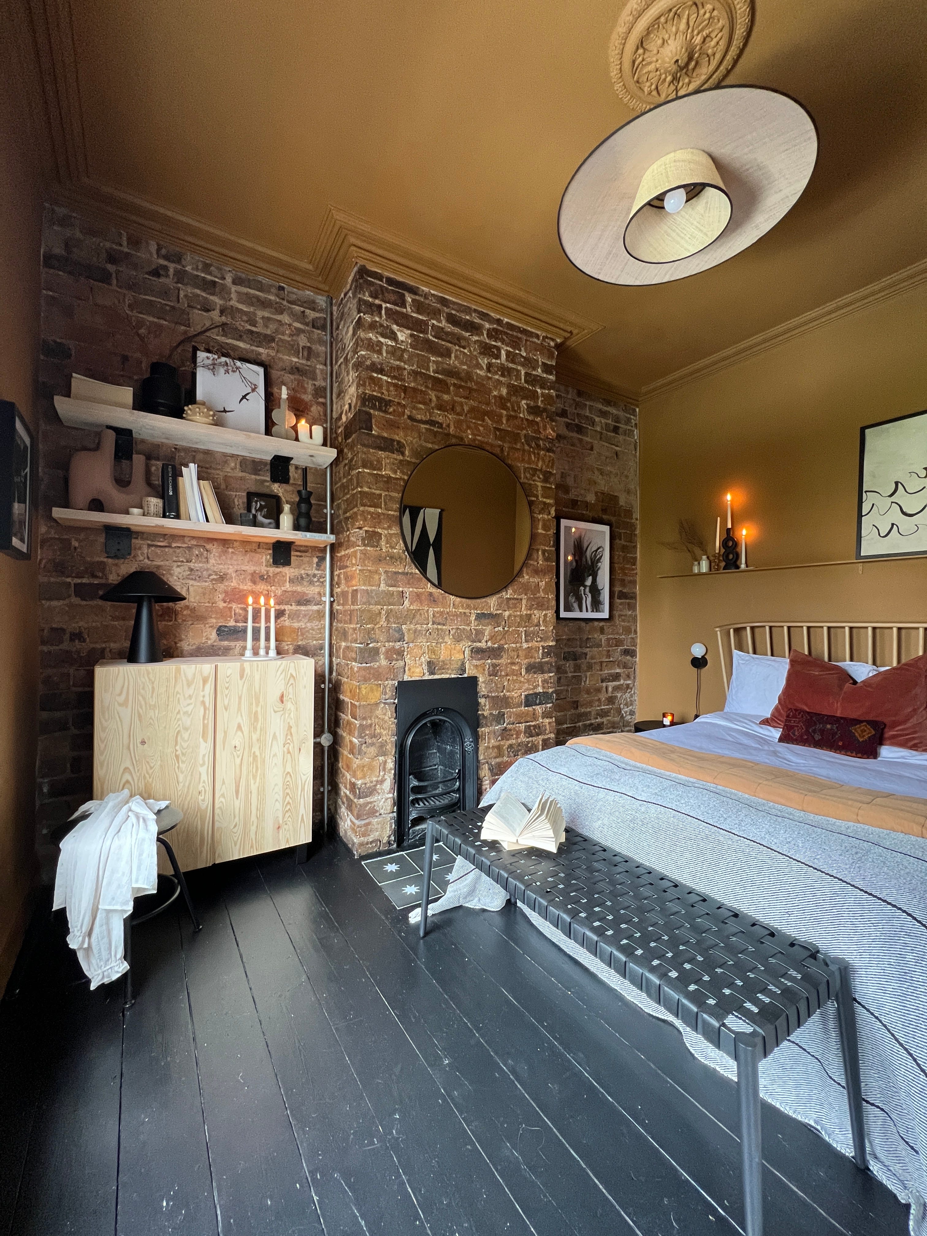
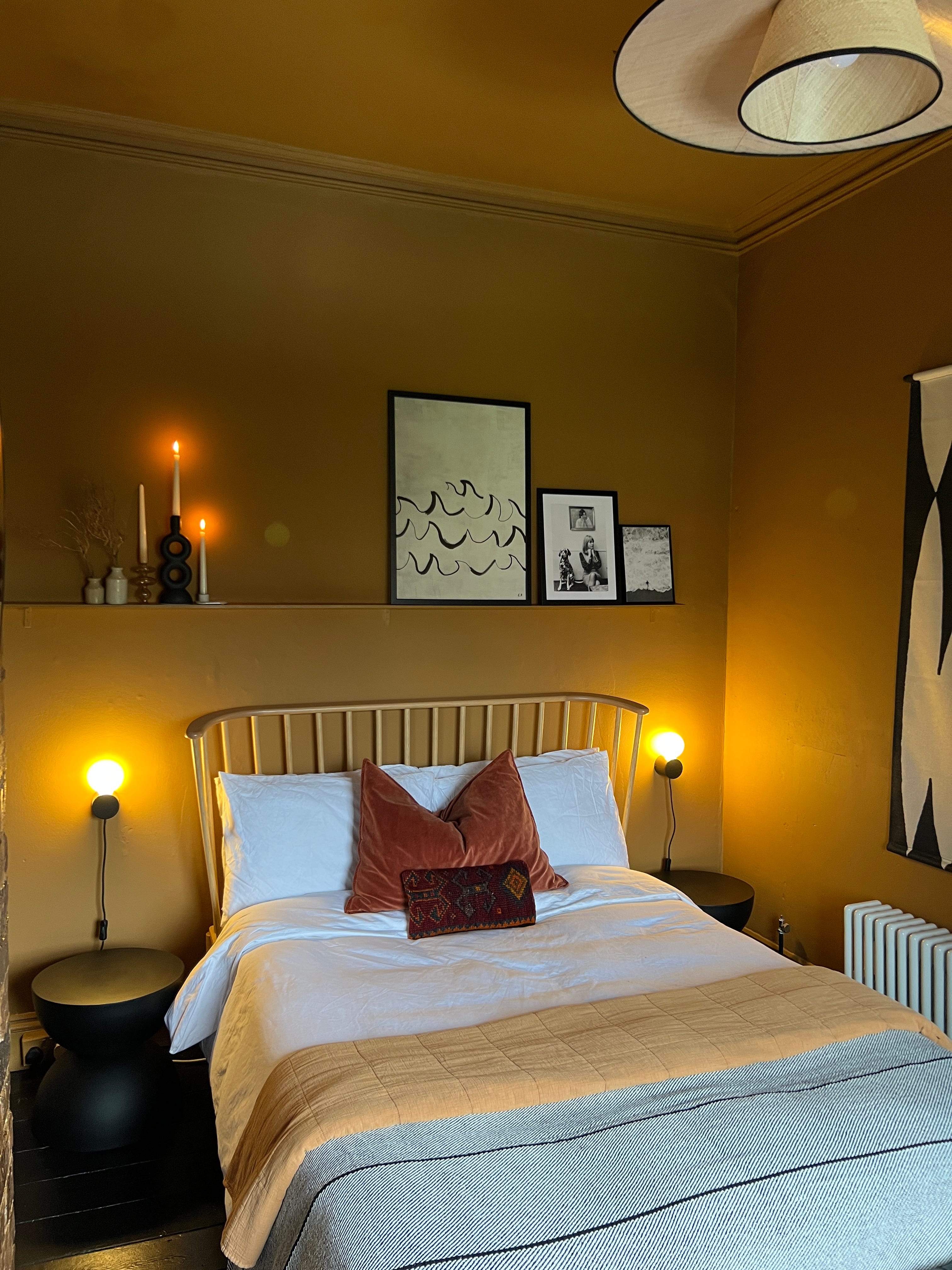
After much deliberation, I decided to go with Galette, which, is described as a ‘mid weight orange brown’ and really reflected much of the browny, tan-like hues I already have in our home. I knew it would work. It also pulls on, and compliments the original brickwork, which can be tricky to get right. A colour that, on first glance, isn’t necessarily an obvious choice for a bedroom but that evolved throughout the day and settled into something quite magical in the early evening (I love a complex paint and this does not disappoint. It can appear quite ochre at times in sunnier light, then mellows to something much browner and caramel-y.) Plus, and most importantly, it worked well with what we already had.
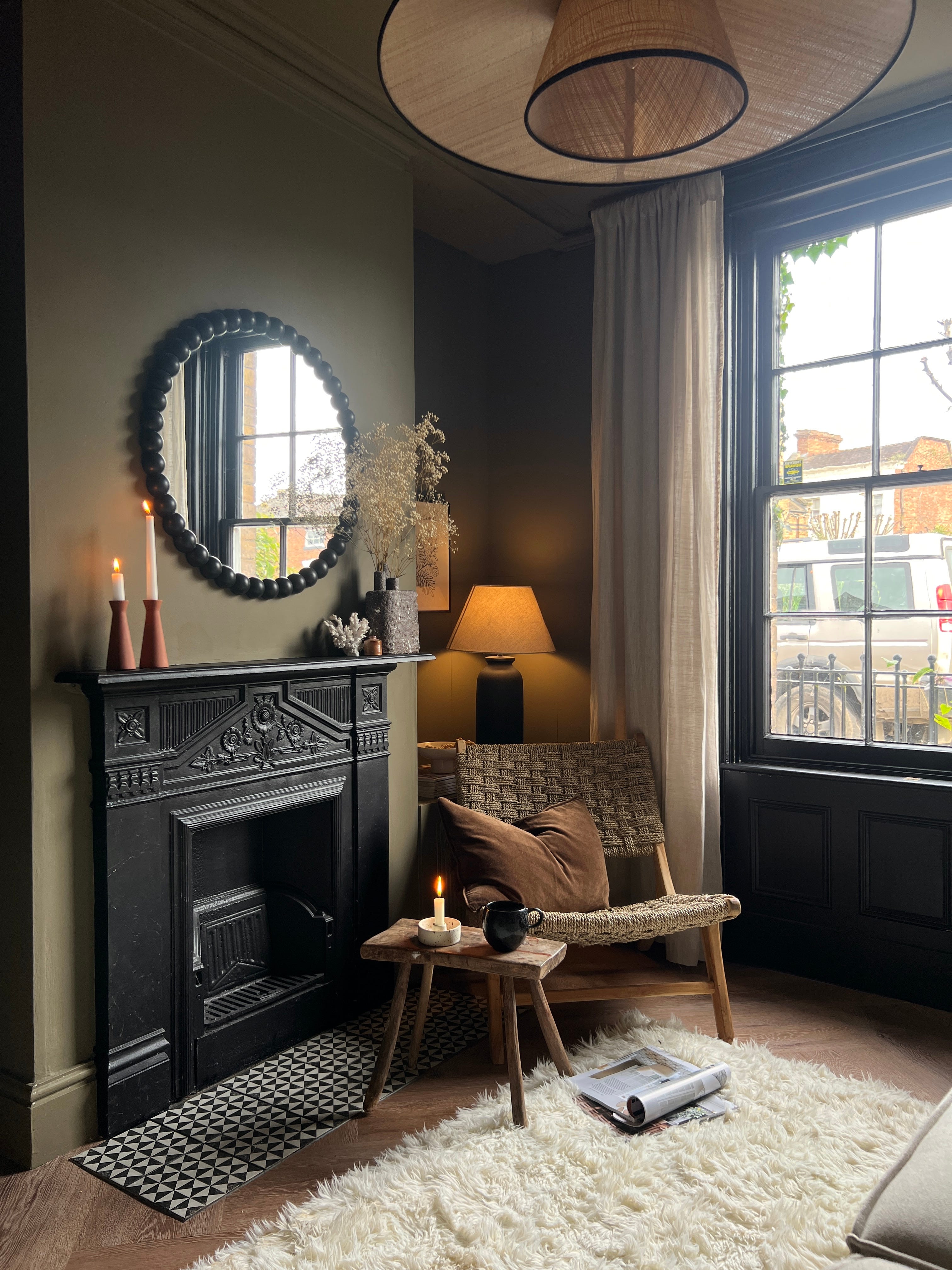
As a long standing fan of colour drenching, I’d also already decided to take the colour on to the ceiling and trim. Colour drenching is the perfect option if you lack a steady hand as the technique negates the need to cut in. Aesthetically it also helps to create the illusion of space, especially when using deeper colours as they eradicate the demarcation lines (where walls and ceiling meet) creating instead a seamless look. Colour drenching works with any shades, but specifically with those darker hues, helps to draw on their rich, cocooning nature.
I also took the floor from white to black, using my hero product; Farrow & Ball’s Modern Eggshell in Pitch Black. In my opinion, there isn’t a denser black on the market. IT IS SO BLACK. And the finish is sublime, hard wearing and incredibly durable plus, it is SO easy to apply (it’s thin consistency means it dries super fast to a mid sheen finish.) I love the black against the new wall colour and think the flooring really anchors the space.
And whilst we’re at it; a note about darker paint colours.
A perceived lack of space can often wrongly signal a need to go lighter. The adage goes; if a room is small, paint it white, or at least, paint it light, and whilst I love light, bright tones in larger, well lit rooms, I prefer darker colours in rooms with little natural light and which are more compact.
On the contrary, if you find yourself in less spacious surroundings, or in a room with cooler, more northerly light then darker paint hues may just be your new BBF. You see a small room is just that; small, there’s no way to change those petite proportions, so I don’t try too. A clever design trick is to lean into what you think is a ‘flaw’ and go with it. Lack of light? Go for darker or warm, mid tones and optimise that den like feeling. Tiny space? Go darker and instead of focusing on the measurements, blur the edges and lean into that cosy feeling.
My snug is another example of (a very) small room (2.7 x 3.5) where I have used a deeper colour, again utilising the colour drenching method. It is a north facing space but with lots of (cool) light.
Where to put stuff.
First up was reassessing the space and how we use it; including a furniture reshuffle. We decided to reposition our bed against the back wall to open up the space. In its previous incarnation, it had been against the wall opposite the fireplace but this often felt restrictive and cramped. The change up helped to give the room a new lease of life, and of course, gave us a view out of the beautiful sash window.
Freeing up the area at the foot of the bed meant I was able to take advantage of this newly acquired space and pop a bench at the end of the bed, one of my all time fave decor tricks (I also love a console behind a sofa but that’s for another day!)
We added some inexpensive wall lights from Habitat, which I painted black, to the wall behind the bed and a narrow ledge; just above the headboard using one of the strips of wood taken from where the panelling had been in the old set up.
Shelving/ linen store
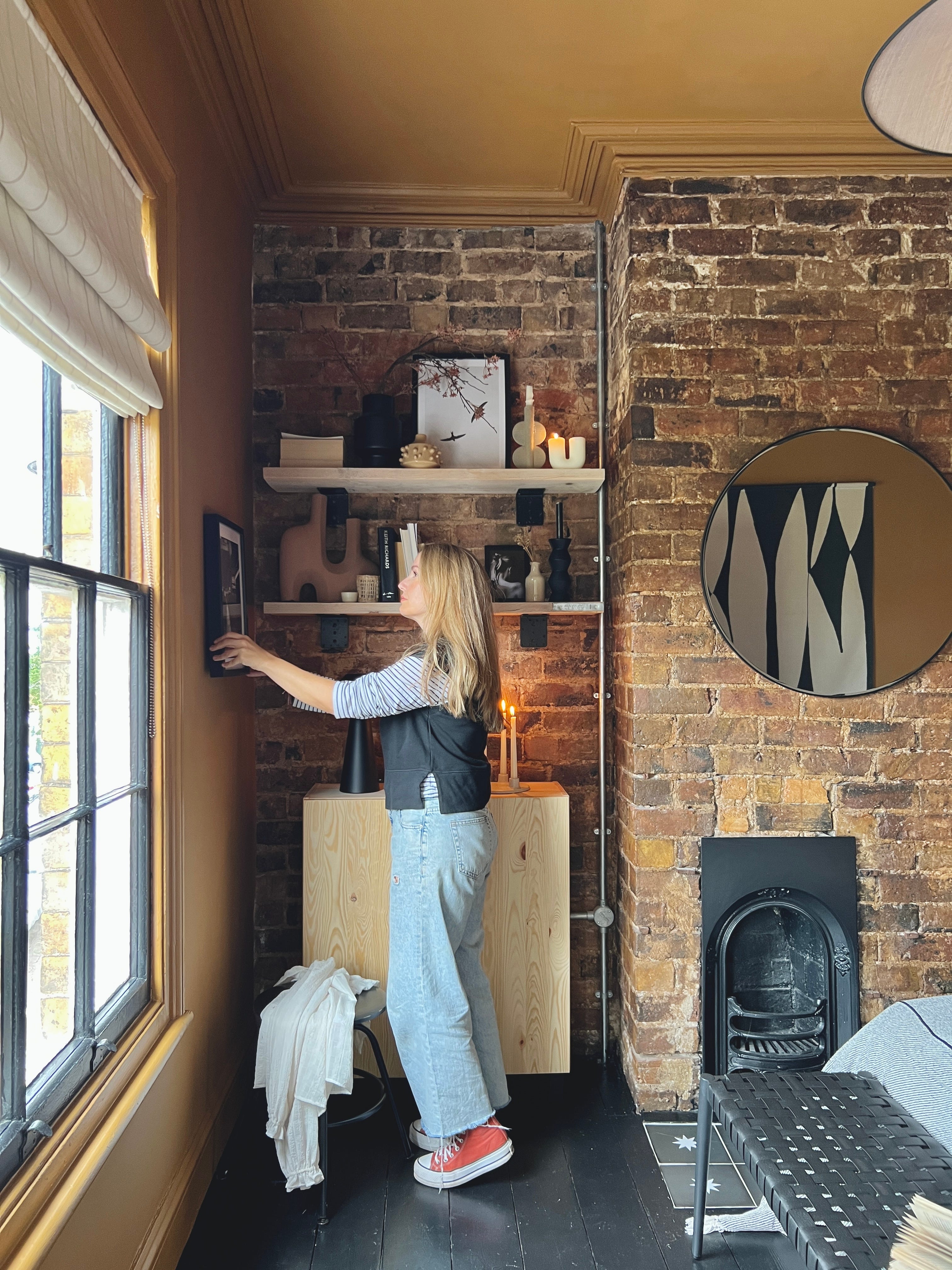
I’d bought two Ikea IVAR cabinets for a proposed DIY in our downstairs space but having not actually used them, decided the one unit would work brilliantly in this alcove (see above.) I love Ikea and this piece is slim, can be wall hung and customised. It’s also a lower cost option which can be painted.
We don’t need to keep our clothing in our bedroom as we used our third bed as a dressing room so actually, lots of storage isn’t a necessity. I did however want something that I could use to store our spare bedding, and also create a styling moment. I cut down some old scaffold board, and attached them to the brick with some chunky brackets. These additions have given this corner purpose and help to craete a cosy vibe whilst not encroaching on the space.
The Details.
I changed up the ceiling light, and went for this beautiful rattan number from Habitat. It is *such* a show stopper but still earthy and natural (I also have it in our snug and just love the shape and large width!) and added art we already owned to the walls, and ledge.
The whole project was very inexpensive, especially as I did all the remedial work myself (well, mainly) and was a great exercise in restraint. Usually when I embark on a room update, I like to invest in new pieces, but this wasn’t an option at this time. If you read my last post, you’ll know that around the time we started the makeover, crisis hit, and some extra vigilant budgeting ensued. In a way, I’m thankful as it encouraged me to think me to think more creatively, to repurpose and to shop my home.
I’m really happy with how this space has evolved. Even more so, that is was such a low cost update. Proof you don’t need to spend a tonne to make a big impact, and that, moreover, paint is such a powerful tool.
What do you think?
Love, Nina x