


This week in thoughts: back to the neutrals-my cosy, cottagey living room plans...
Finally saying goodbye to the blue


If you follow me on instagram, you’ll know how much I’ve come to absolutely LOATHE the blue walls in this room. Having lived with the DeNimes for almost 18 months, I feel this feeling deeply. This is not an impulsive decision (although I am; very impulsive) but one that oddly, is actually undoing what was initially, an idea born out of impulsivity and now, regret.
When we moved into the cottage, I was determined to do things as differently as possible from our old house. Mainly because I bore easily and wanted to try something new, but also because the very contemporary, Scandi-Rustic style of our previous home didn’t feel like it would work in this home. I wanted colour, and I wanted to do something uncharacteristically, ‘on trend’ *shudders*
I am ashamed of how easily influenced I can be, when I am not fully focused, and allowed the sweep of blue interiors-from powder to pastel, to completely and utterly blindside me. Hence the blue living room and my increasing frustration with it.
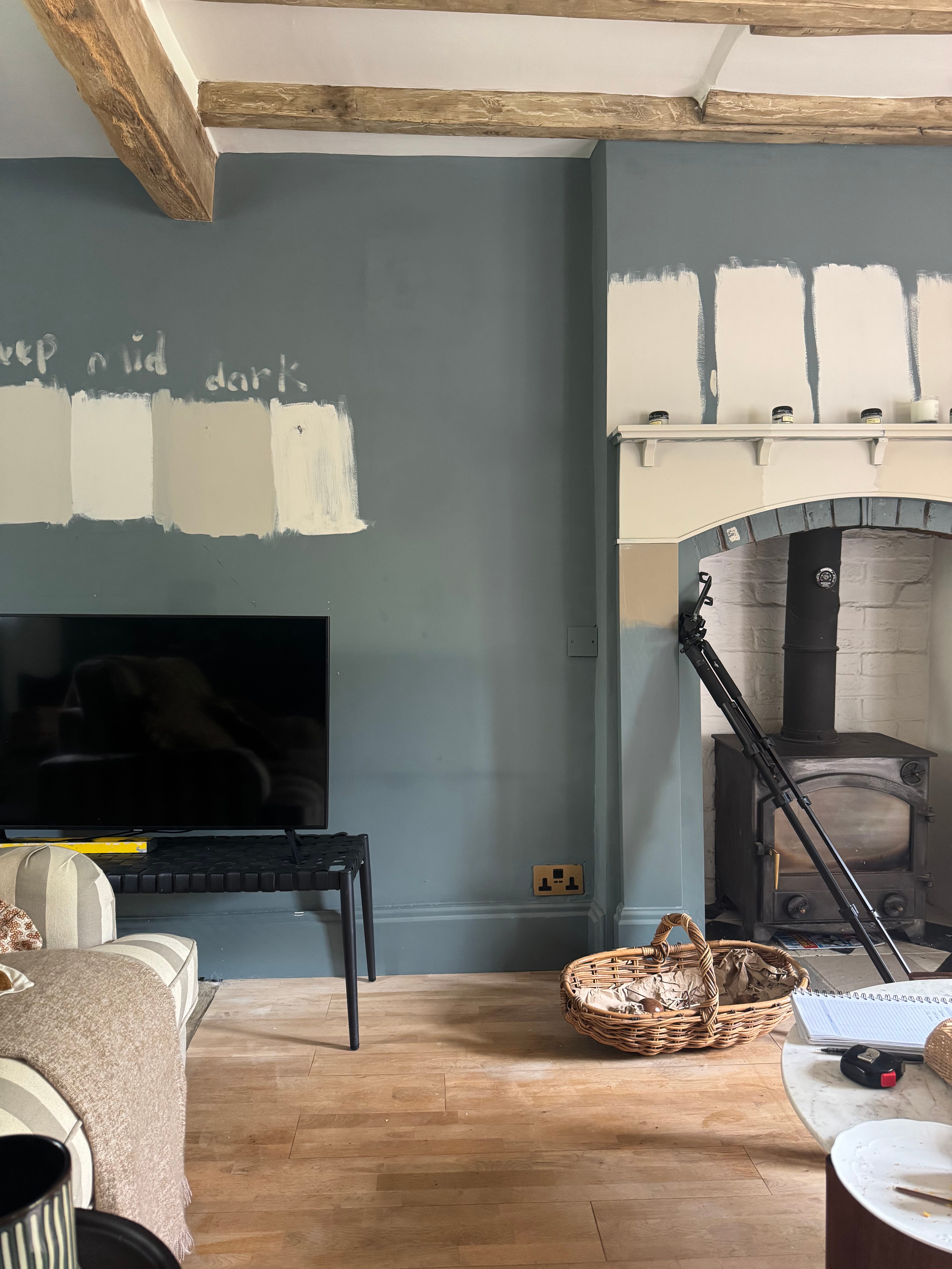
The living room is one of the rooms I felt really excited by when we first came to view the cottage. Compared to our old house, it is HUGE although, generally, I also think it’s a brilliant size for what is actually, not a very big house. It has lovely (albeit slightly orange at the time of viewing- of which we’ve since rectified) ceiling beams, brand new UPVC windows and just a really airy, open ‘good’ feeling to it. I felt thrilled at the thought of decorating it, and without even really thinking about whether blue would work, or whether I’d actually like it in one of our spaces I set about testing a few shades I thought would work. I finally settled on Farrow & Ball’s iconic DeNimes which, despite my not liking it much, is a glorious dusty blue with very grey undertones.

I should’ve known at this point then that perhaps, blue wasn’t for me; as, out of all the samples I’d tried, DeNimes felt like the least ‘blue’ of them all (in that it has more of a subdued quality.) It seemed almost ‘earthy’.
I am a big fan of moodier tones, especially very natural colours and so in this sense, despite being a blue paint, DeNimes felt the most ‘right’. Of course, when It was first decorated I loved it and swore that I was indeed also a ‘blue person’. It felt cosy and unique, trendy and cool. But alas, as time marched forward I found myself pouring over off white cottages on Pinterest and feeling sad that mine was so; well-blue.
Turns out, my blue lounge was making me blue.
Crucially, as I have found my feet in our cottage, and decorated other rooms; especially those upstairs- I have found myself gravitating back to neutrals; soft browns, khakis, creams, and a splash of murky green. These are the tomes that feel like me, the ones that are reminiscent of a landscape, and the ones I never ever tire of. They are the colours I dress in, and they are the ones that make me feel grounded and safe. I love texture and I love layers and my opinion is that these elements work best with a base that is gentler on the eye and far less saturated.
Neutrals are sometimes considered ‘basic’-less exciting or less fashionable but I also think they are popular for a reason. They are classics for a reason. The hatred for beige comes down to how people use it as opposed to the colour itself in my opinion. Beige and it’s quieter counterparts are anything but dull when done well. It’s all about the materials you use, the contrast and detail that you incorporate that elevates these soft and subtle hues. Can they be boring? Sure! But colourful interiors can equally be done very badly.
And so with that in mind. I’m repainting it, and also making some other changes to furniture layout, adding in some shelving and making my cosy living room dreams come true….
My Living Room Plans:

Walls:
Earlier this week, I tested some off white paints in the room. To be honest, I already sort of knew what I wanted having researched colours for the majority of the year but, because I am a grown up, I wanted to make sure my intuition was correct.
After much deliberation, I’ve settled on Little Greene’s Slaked Lime Mid on the walls and Slaked Lime Dark (which is a tiny bit deeper and darker but still very light) for the fireplace mantel and the door opposite (see below) to add contrast and depth to the room. Slaked Lime Mid is classed as an ‘off white’ paint but I love that when paired with very bright or ‘pure’ white, that you can really see the difference. I also love Little Greene; and have it absolutely everywhere. Farrow & Ball is very good, I just personally prefer the application of Little Greene, and I think their eggshell is far superior.
When choosing my preferred colours, I also factored in room orientation (it is southeast facing and mostly filled with very warm light.) The sofa (which is a very deep, mossy/ sludgy green; and also the largest piece of furniture-one I am planning on keeping for years to come) and finally the ceiling which is already painted in Slaked Lime. Using other shades from the same color scale allows me to avoid repainting the ceiling (which is surely the worst job EVER) and moreover, it means that I don’t have to worry about how the tones will work together because I already know they will. Hurrah.

TV Wall & Shelving:
We managed to sell the habitat console on Facebook Marketplace which originally lived in this spot. Honestly, it was an impulsive purchase and on reflection; too small, and added too much additional wood to the room. My goal is for the ceiling beams to really stand out and so we have decided to create something similar to the image below in the largest alcove whereby we will be installing two parallel shelves across the entire wall to add length and to ‘frame’ the TV. I love how the shelves can be decorated, it’s a great way to diffuse the TV! I will be painting our shelving the same as the walls so that it feels more streamlined and doesn’t compete with the wood of the ceiling beams.

Arched Alcove & Shelving:
I don’t think we’ve ever really tapped into this lovely feature and as a result, it’s always felt a bit ‘bare’ and sort of forgotten about. Now that we are moving the TV over to the other wall, my plan is to install three shelves into this alcove (the top and bottom shelves will match the opposite side of the fireplace with one more in the middle) and make more it feel more purposeful and hopefully useable. A chair, side table and lamp, art and decorative items will hopefully give this little corner a lease of life, and connected to the rest of the space.

Sofa area:
I will be adding a pre-owned console behind our settee for a few reasons. Firstly, we have had this piece since we moved in here. I was originally planning on using it elsewhere but unfortunately, it’s been collecting dust for months-and so I thought I’d try it behind the sofa instead. I instantly loved how it looked and felt so decided to keep it there. It makes the sofa feel really cosy, anchoring it more effectively. It is also, to mu husband’s delight, a handy additional surface for drinks and snacks (and of course, styling.)
Secondly, the room is actually quite wide and although I adore the extra space, I feel like there is almost too much of a ‘chasm’ between things!? I want to ‘close things in a bit’ so that watching telly and chatting feels a bit more personal and thirdly, I wanted to remove the gallery wall (which felt too high and one dimensional) and use something shorter to help ‘bring’ down the height of the room and create a more intimate feel.
Similarly, I am also going to remove the curtain poles from their current position, and reinstate them so that they are level with the top of the windows. The advice is always to hang curtains as ‘high as possible’ but in this particular space? I just don’t think they look right-maybe it’s because it’s a cottage whereby stuff just works better at lower down? The bottoms of the curtains are also in bad nick so I'm going to chop off the damaged material and wonder web them.
I created the the image below using ChatGTP to get an idea of what the walls would look like ‘lighter’. It also shows how our lovely sofa (which I also think works so much better with paler walls) functions with the console behind it. It add so much visual interest without losing lots of floor space.

I’m not going to be spending a tonne of money on this project (mainly because we don’t have lots of it) but also, apart from a couple of things, we don’t really need anything new. I have decor, and bits to furnish the room and will probably then reassess once the makeover is complete and I have everything back in it’s rightful place. I tend to wait until that point before buying anything because it’s easier to see the ‘gaps’.
I am so flippin’ excited to start on it! I’ll be prepping the walls the remainder of this week with a view to start painting on Friday. There are holes to be filled, rough patches to be sanded and a whole lotta floor to restain before I can even think about think about doing anything fun. I hate prep but I also love a really well finished space so I guess I’ll have to pull my big girl pants up and get on with it.
Wish me luck!
Until next week,
Nina x