
This week in thoughts: how to hide a telly without buying a Frame TV...
...and why there's no shame watching television in our bedrooms.

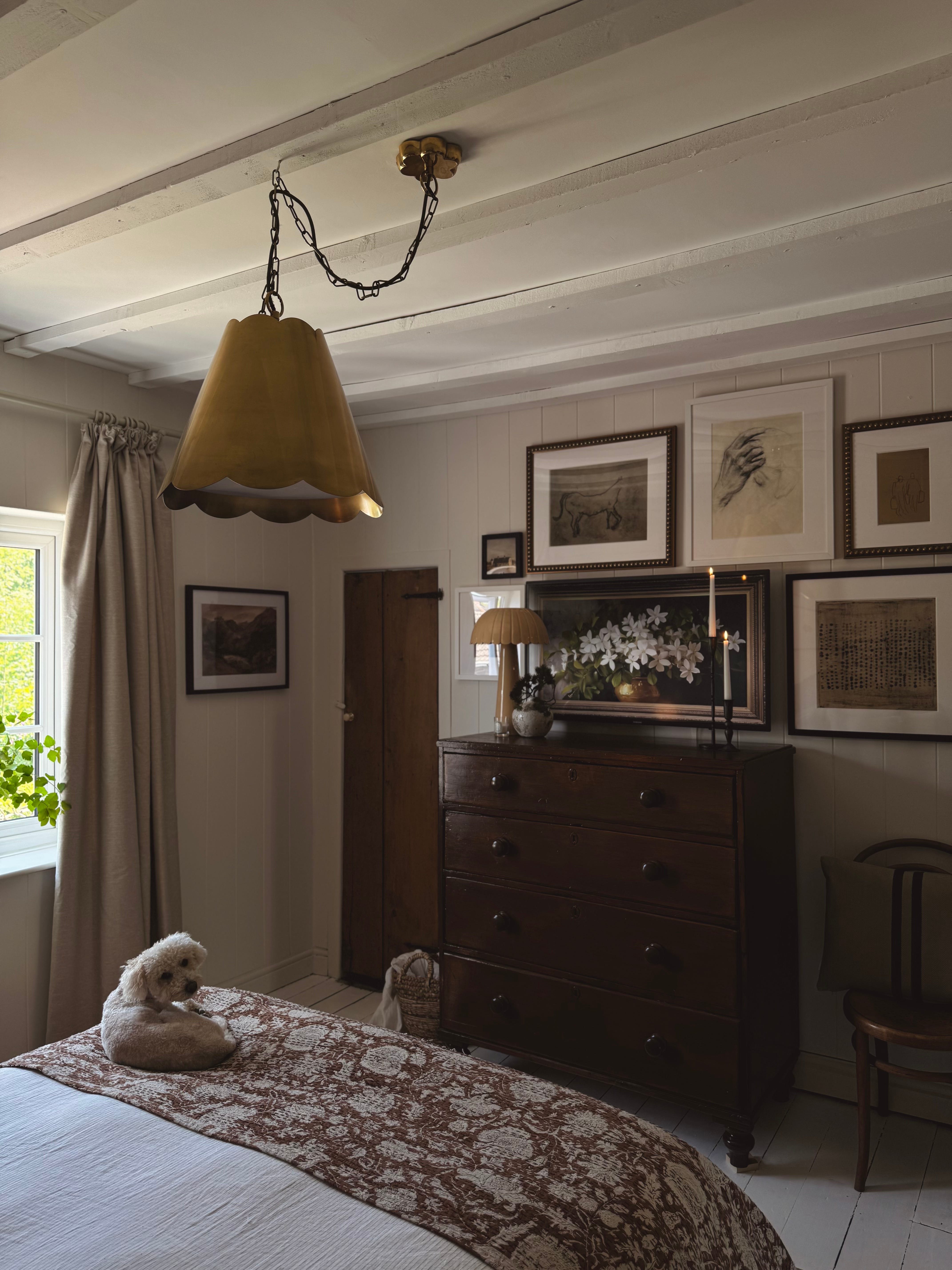
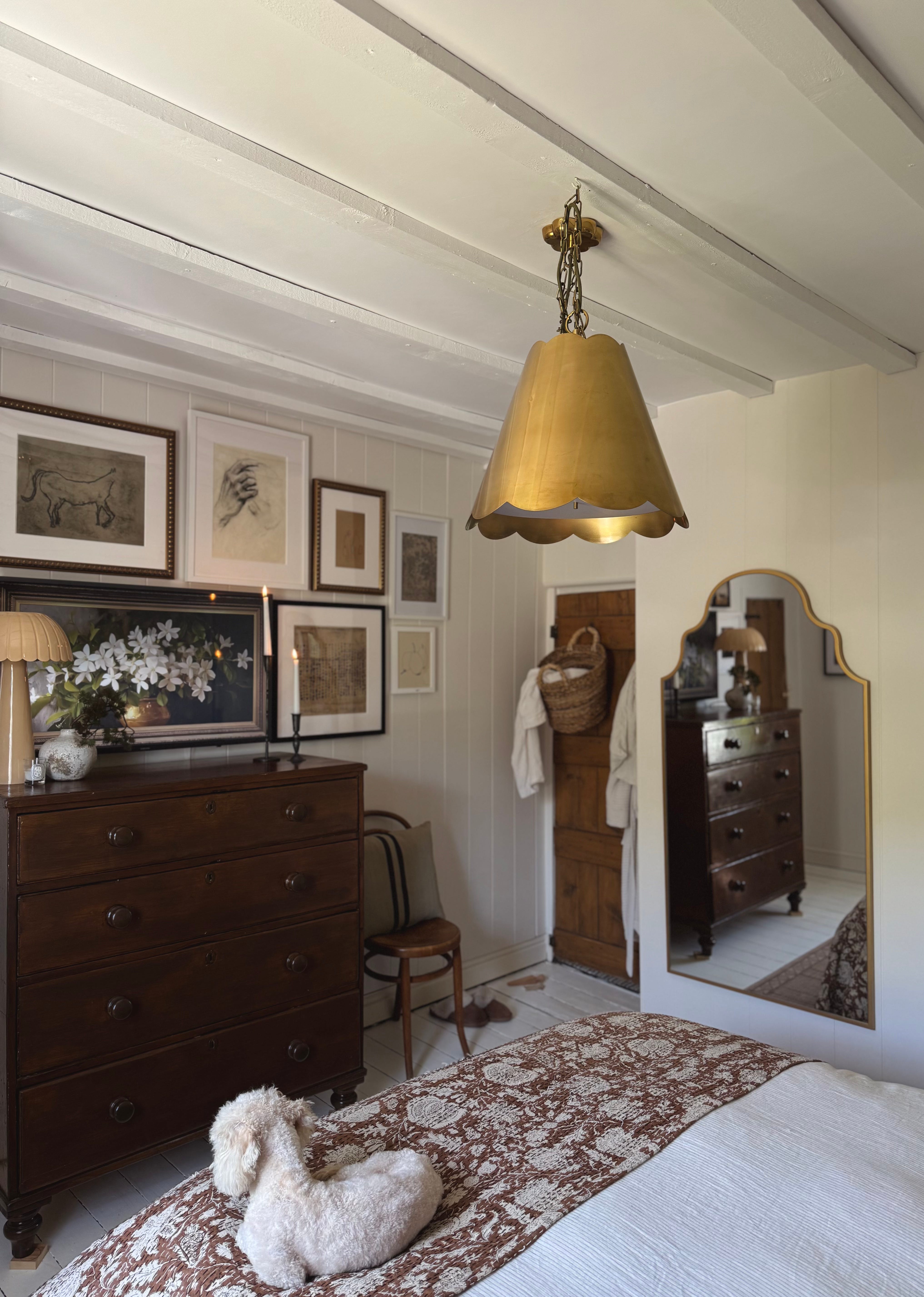
One of my favourite features in our bedroom is the TV/gallery wall. I LOVE it SO much….
Often, when we visualise a space; how we want it to look, the end result isn’t *quite* what we imagine-it’s a little off, or something about it doesn’t quite align with how we see it in our heads. I’ve been there many times, and it feels SO frustrating, but I’ve also learned the hard way that planning (even if it’s very fluid) is the answer to eliminate disappointment and to ensure that your expectations match reality.
I think one of the main reasons I love this corner so much is that it turned out EXACTLY how I imagined it, and crucially, how I planned it. No disappointment or regrets, just satisfaction that it went smoothly, and without error.
Here’s a step by step guide to how I did it:
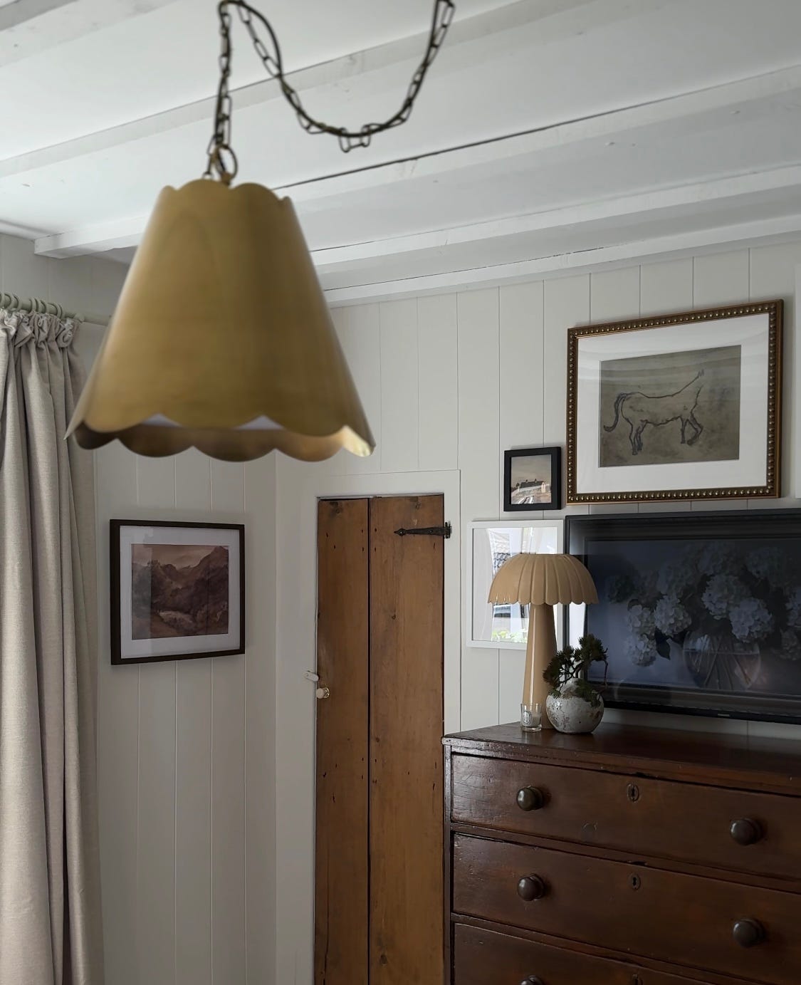
We already had the chest of drawers but initially, my plan was to sell them on and replace it for something longer and lower. I’m so glad we didn’t! A darker varnish to add depth, plus adding the chair at the end to elongate the space, has made it feel brand new and balanced the area better.
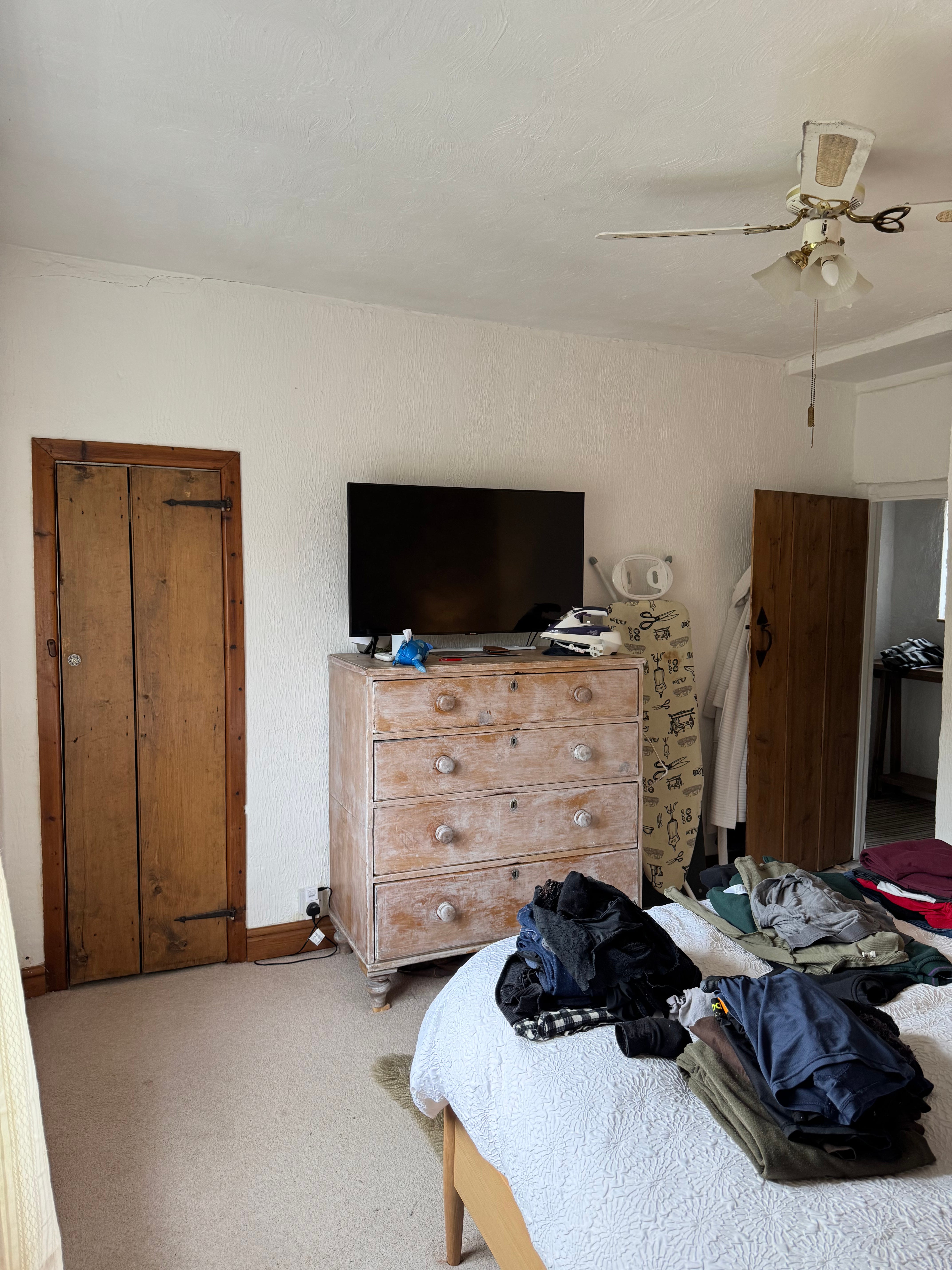
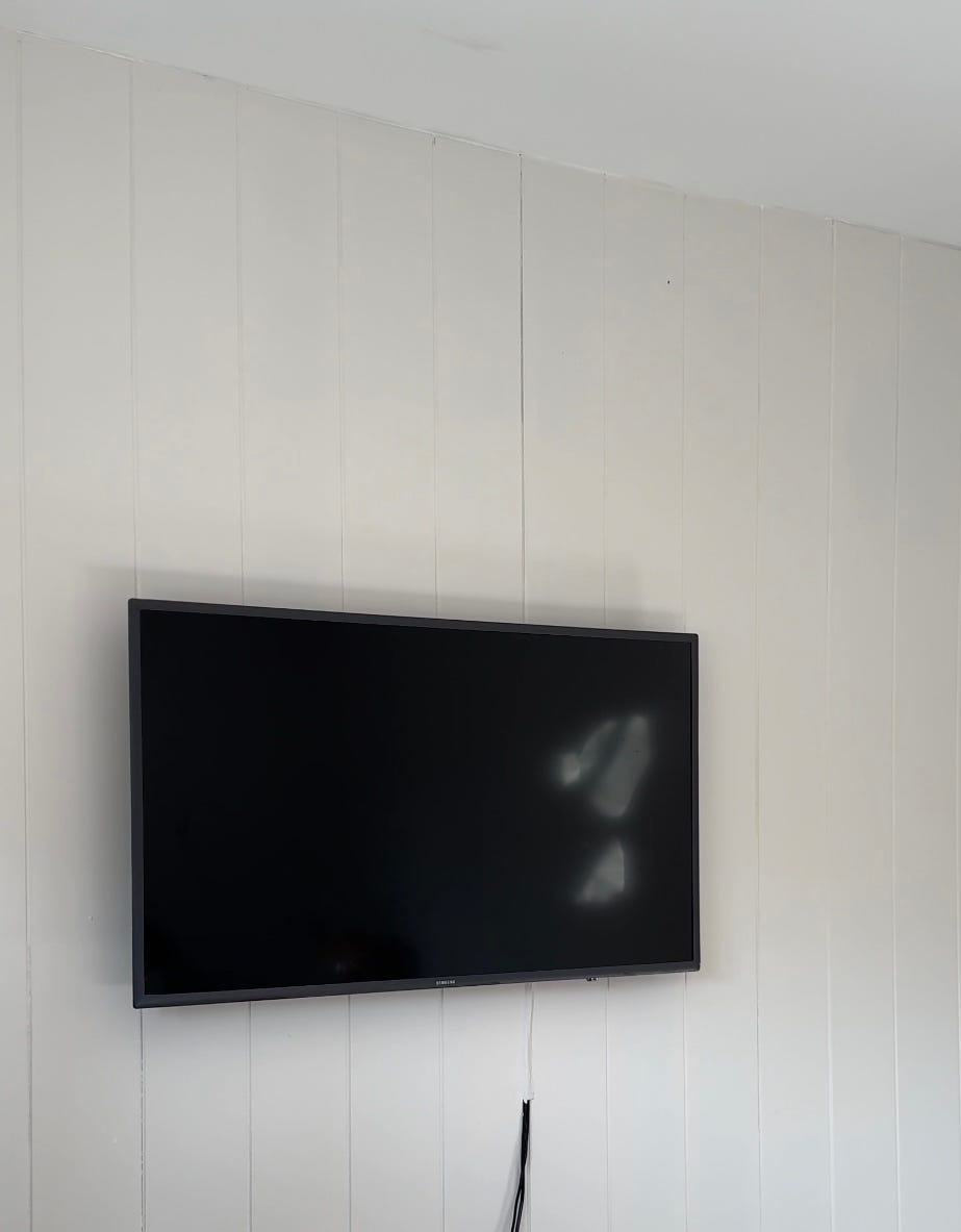
I used a dark stain from Ronseal, but it needed a LOT of thin coats to cover. You can see how the chest, and general area, looked before the makeover in the image below. I’d previously white waxed the chest of drawers, and had to remove that prior to restaining. I used turps, and it literally slid off!
Once we’d cladded and painted the room (you can read about that part of the project here) we decided on the position for the chest. This element of the project was crucial to the overall goal because I wanted the TV to be directly above the chest, and central. It’s worth getting details like this right, even it feels boring because often when a room feels ‘off’ it’s because items within that space aren’t aligned correctly, or are unbalanced.
We’ve had our telly 8 years; it’s still functions and it’s pretty slim (not as flat as a Samsung Frame but not chunky by any means.) I really dislike TVs on stands, or units and generally prefer when they are anchored on to a wall because they feel more ‘tucked’ away- and thus helps to free up space on whatever furniture it is placed above.
To mount our telly to the wall, and ensure it remained as close as possible to it, we used a super slim mount from Amazon- this one has a built in spirit level; too which was handy!
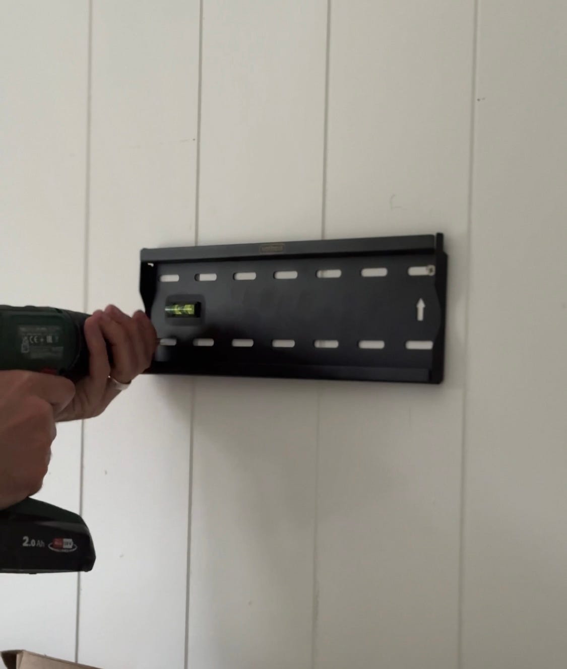
Once the telly was secured, I added masking tape to the exposed wire and painted it. You can’t even see it, especially with the art!
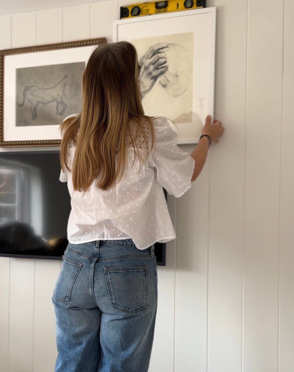
Then it was time to install the art! When choosing my pieces from Artfully Walls, I cut up some lining paper, roughly estimating the size and shape in order to ‘map out’ where the art would go, around the telly. This helped me calculate which size frames I would need, and whether I needed landscape, portrait or square in that space. I didn’t take any pics of this part of the process sadly but have included the below image which demonstrates this technique.
To be honest, I’ve never planned a gallery before-I usually wing it, and I sort of let the art find its position and do the ‘work’. On this occasion however, and because I had to factor in the TV; which is static piece, I wanted to make sure I got the proportions of the pieces correct.
It’s definitely a really useful trick; and one I’ll be using when I re do the living room.

A spirit level is a non-negotiable when hanging art. I have a good eye, but our walls are very wonky; which often throws me off! To attach the art, I used Command Hooks. This is my favourite, go-to way to hang art. Firstly, it saves creating holes in your walls- which isn’t ideal; especially if your walls are freshly plastered or panelled, and secondly, I really like that you can ‘stick’ the whole picture down! I can’t bear a wobbly frame and a Command Hook prevents this from happening. People have differing views on them, but I personally think they’re a great product and recommend them if you hate hammering and if you want your art to stay firmly put.
There’s no right or wrong way to hang an art wall, but I generally stick to the following principles when creating my own:
I like smaller gaps between the frames. I just think it looks better personally and defines the fact that it is a ‘cluster’ of art. I tend to go for around an 1-1.5 inches.
I generally avoid other art in a space, especially in groups, if I have a gallery wall in that room. I might add one or two prints to another wall, or on top of a mantel, but I’ll only do one ‘gallery’. It can feel too busy otherwise, and detracts from the key focal point.
I keep all of my art very tonal- that way, you can add quite a few pieces without it feeling overwhelming or ‘cluttered’. I love an earthy palette and stick with that!
I like to mix frames but limit my selections to wood, brass/ gold, white and black. This creates some contrast, but is still harmonious with other elements of the room. Obviously if you’re a colour lover and reading this then you do you, however, I’d still recommend limiting how many colours you use and potentially, if your art is very bright/ multi-shaded, using only one dominant color for your frames (just to keep things feeling cleaner.)
Big mounts make art feel more expensive and create more visual ‘space’.
I like to mix genres and generally include animal motifs (I just love birds!), a little typography, landscape and portrait, still life and maybe abstract. I also like to contrast media (e.g., some sketches, oils and watercolour.) If you aim to choose pieces that fit into a wide range of genares you’ll end up with a lovely, eclectic gallery wall that feels unique and personal.
If you’re decorating around a TV like me, ensure that you position art around the sides and top, so that the pieces ‘hug’ the TV. This helps it to blend in, softening the look of it and making it feel more like an additional piece of art within a picture wall.
I ignore the eye level rule. For maximum drama I love art that is hung very high/ very low. It’s unexpected and less ‘contrived’.
There’s no rush. I like to take my time. Hang something, step away and observe, go back in etc, making small adjustments as I go.
Once the pictures where in place it was time to decorate the chest of drawers. Another trick I like to implement in a situation like this and especially if you’re trying to hide something like a TV, is to group items together at both ends of the device, and stagger them at the corners. So for example in the image below, I use a lamp, which is placed just in front of the ‘edge’ of the TV to blur that line, with a smaller vase and candle- these pieces diffuse the sharp angles of the telly and more importantly add visual interest to the surface area. Often when we watch the TV, we move the lamp; but for me that’s not an issue because I enjoy how it looks. I don’t mind shifting it and plus, we don’t always move it to be honest because you can still see the screen.
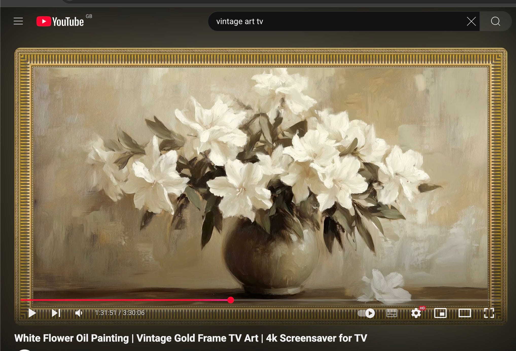
And finally, to get the TV to resemble a piece of art (note, it’s not perfect!) I use a great hack and if you have a SMART TV, you can do it too. All you need to recreate this ‘art’ is to go to YouTube and type in “Vintage Art for TV” on the search bar…(see below…)
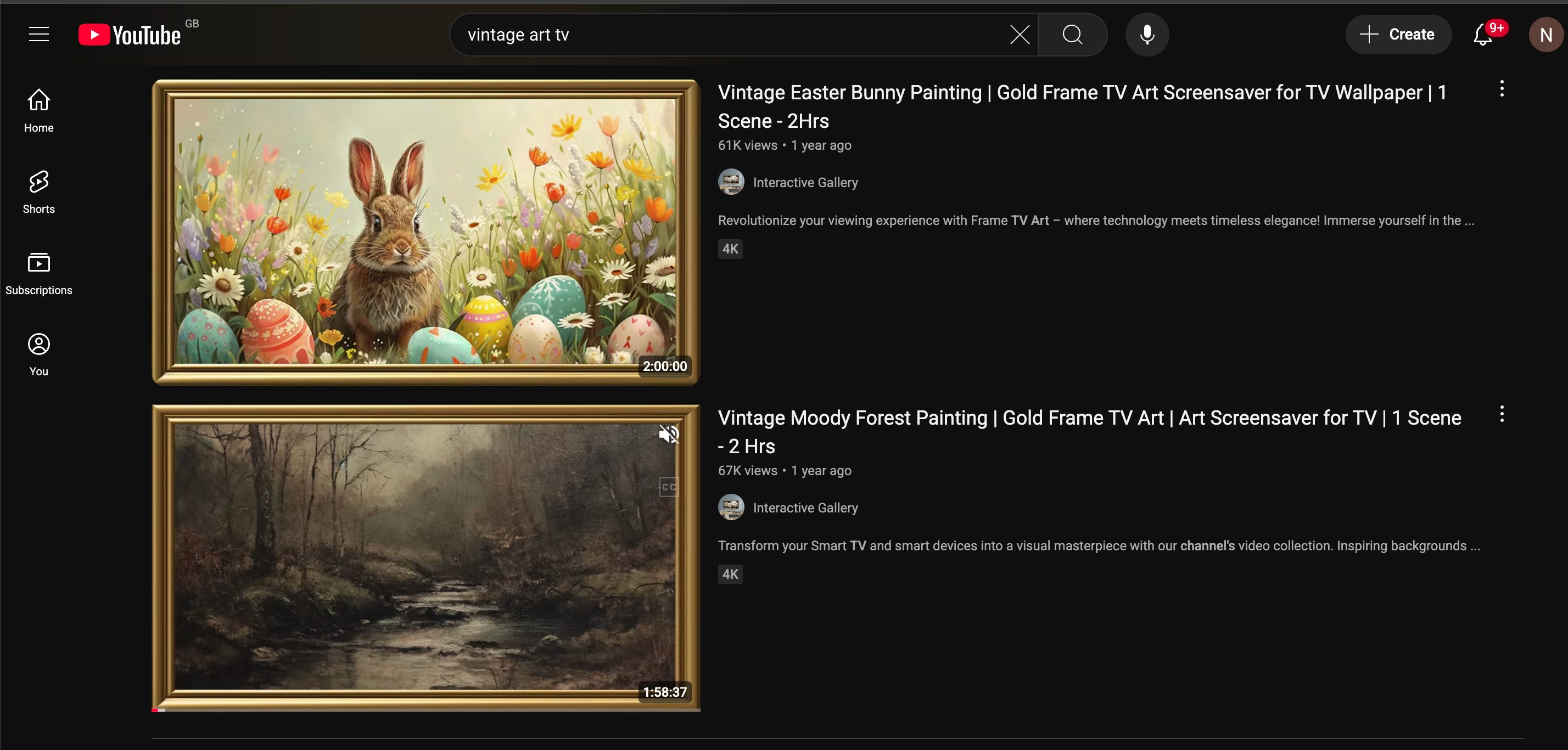
There are LOADS of free options and many have a ‘frame’ effect around them (some are bit naff so you have to really dig)
Once you’ve found one you like, simply click on it and it will act as a screensaver. We don’t use all day, everyday as obviously it uses electricity but it’s nice occasionally! (also useful if you’re a content creator and want to hide your own television/ add some pretty art.)
Until next week,
Nina x
Fabulous ideas 💡 👌